What Are Power BI Custom Visuals and How to Use Them?
In today's data-driven world, it’s not just about gathering data it’s about how you visualize it. Power BI, Microsoft’s powerful business intelligence tool, empowers users to transform raw numbers into meaningful insights. But what if the built-in visuals aren't enough for your specific needs? Enter Power BI Custom Visuals, a game-changing feature that lets you go beyond standard charts and graphs.
Whether you're just beginning your journey with Power BI online classes or aiming for a Microsoft BI developer certification, understanding custom visuals will elevate your data storytelling skills to a whole new level.
1. Introduction to Power BI Custom Visuals
Power BI custom visuals are user-created or third-party visual elements that extend the standard Power BI chart library. These visuals help users create advanced dashboards that can better suit specific business use cases, industries, or user preferences.
If you're currently enrolled in Power BI online courses, you've likely already used visuals like bar charts, pie charts, and line graphs. But what if you want a Sankey diagram? A bullet chart? Or a KPI gauge with more control? That’s where custom visuals shine.
2. Why Custom Visuals Matter
While Power BI includes a wide array of standard visuals, they may not always meet the nuanced requirements of data analysts or business users. Custom visuals allow professionals to:
-
Represent complex datasets more intuitively
-
Tell stories that resonate better with specific stakeholders
-
Design dashboards that align with brand and business logic
-
Customize interactions and formatting beyond default options
Statistics That Support Custom Visualization:
-
According to Gartner, 65% of organizations say poor data visualization hinders decision-making.
-
A Microsoft study found that dashboards with tailored visuals improve executive-level understanding by up to 70%.
Clearly, custom visuals aren’t just “nice to have” they’re essential in many business scenarios.
3. Built-in Visuals vs. Custom Visuals
|
Feature |
Built-in Visuals |
Custom Visuals |
|
Available Out-of-the-Box |
Yes |
No (must be imported) |
|
Advanced Customization |
Limited |
Extensive |
|
Interactive Capabilities |
Standard |
Highly Flexible |
|
Community Support |
Strong |
Strong (Marketplace + GitHub) |
|
Skill Level Required |
Beginner |
Intermediate to Advanced |
Custom visuals offer enhanced capabilities, but they may require additional knowledge—something that’s often covered in Power BI online training programs.
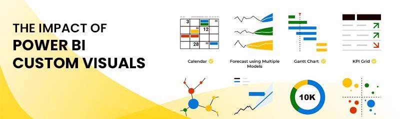
4. Types of Custom Visuals in Power BI
Here are some popular types of Power BI custom visuals commonly used in the industry:
-
Sankey Diagrams – Great for showing flow between categories (e.g., customer journeys)
-
Bullet Charts – Helpful for comparing performance metrics against targets
-
Chiclet Slicers – Stylish slicers that improve filtering UI
-
Gantt Charts – Perfect for project timelines
-
Radar Charts – Ideal for performance benchmarking
-
Word Clouds – Effective for text data visualization
5. How to Import and Use ustom Visuals
If you're attending Microsoft bi developer certification classes, this step-by-step guide will feel like a hands-on lab.
Step-by-Step: Adding Custom Visuals
-
Open Power BI Desktop.
-
Navigate to the Visualizations pane.
-
Click the three-dot icon (...) at the bottom.
-
Select Get more visuals.
-
Browse or search from the Microsoft AppSource.
-
Click Add to install the desired visual.
-
Use it like any standard visual from the pane.
Custom visuals can also be imported manually using .pbiviz files.
6. Real-World Use Cases and Examples
Example 1: Marketing Funnel with Sankey Diagram
A marketing analyst tracks user flow from website visit → product page → cart → checkout. The Sankey diagram makes it easy to spot where most users drop off.
Example 2: Project Management with Gantt Charts
A project manager working in a construction firm visualizes task timelines, dependencies, and milestones using a Gantt chart.
Example 3: Financial Benchmarking with Bullet Charts
Finance teams compare actual revenue vs. forecast across multiple regions using bullet charts for clarity.
These scenarios are often taught in Microsoft BI developer certification courses as part of real-world assignments.
7. Creating Your Own Power BI Custom Visual
If you're technically inclined and pursuing Powerbi online training to become a certified BI developer, creating your own visuals is a valuable skill.
Prerequisites:
-
Node.js and npm
-
Power BI Visual Tools (pbiviz)
-
Basic TypeScript and D3.js knowledge
Steps:
Install Power BI Visual Tools:
bash
npm install -g powerbi-visuals-tools
Create a new visual project:
bash
pbiviz new myCustomVisual
cd myCustomVisual
-
Edit visual.ts for logic and capabilities.json for visual configuration.
Run and package your visual:
bash
pbiviz start
pbiviz package
-
Import .pbiviz file into Power BI.
This skill is often highlighted in Power bi training and placement for developers looking to build custom solutions.
8. Best Practices for Using Custom Visuals
To maximize the impact of custom visuals, follow these best practices:
-
Choose Wisely: Not all visuals improve comprehension—choose ones that best fit your data story.
-
Test Interactivity: Ensure visuals support filtering, drill-downs, and other interactions.
-
Monitor Performance: Heavy visuals may slow dashboard rendering.
-
Document Everything: Always label visuals clearly and provide tooltips or legends.
-
Follow Design Principles: Use consistent color schemes, avoid clutter, and align with brand identity.
9. Common Pitfalls and How to Avoid Them
|
Pitfall |
How to Avoid |
|
Overusing visuals |
Use only when necessary for clarity |
|
Ignoring compatibility |
Test across different Power BI versions |
|
Poor performance |
Optimize data models and filters |
|
Data overload |
Focus on key KPIs and metrics |
|
Not updating visuals |
Keep them up-to-date with the latest versions |
10. Power BI Training and Placement: Industry Demand
The demand for skilled Power BI professionals is on the rise.
Industry Trends
-
The global business intelligence market is expected to reach $33.3 billion by 2025 (Statista).
-
Companies hiring Power BI experts span across finance, healthcare, retail, manufacturing, and IT services.
Job Roles That Use Custom Visuals:
-
Business Intelligence Analysts
-
Data Visualization Specialists
-
Microsoft BI Developers
-
Power BI Consultants
-
Data Engineers
Most Power BI training and placement programs include modules on custom visuals to prepare learners for real-world challenges.
Key Takeaways
-
Custom visuals expand Power BI’s ability to convey complex data insights.
-
They are essential for industry-specific dashboards and custom reporting.
-
Importing them is simple, and creating your own is possible with coding skills.
-
Used correctly, custom visuals boost user engagement, decision-making, and dashboard aesthetics.
-
Learning to work with them is a vital part of becoming a certified Power BI professional through powerbi online training.
Conclusion
Power BI custom visuals are more than just flashy charts they’re tools for better decision-making. Mastering them helps you stand out in your journey toward Power BI certification, training, and placement.
Ready to elevate your data skills? Enroll in Power BI online classes today and bring your dashboards to life.