Getting Started with Tableau – An Introductory Guide to Visualizing Data
In today’s digital world, making sense of data is more important than ever. Tableau stands out as a user-friendly platform that allows users to convert raw information into clear, interactive visualizations. Whether you're a student, professional, or curious learner, Tableau helps you understand data visually without requiring deep technical knowledge. This guide is designed to walk you through the fundamentals and help you get started with confidence.
What Is Tableau and Why Use It?
Tableau is a powerful data visualization and analytics tool that enables users to create interactive charts, dashboards, and reports. Known for its drag-and-drop interface, Tableau simplifies complex datasets, making it easier to spot patterns and share insights. Organizations use Tableau to support data-driven decision-making, while individuals use it to explore trends and communicate findings more effectively. Enhance your data visualization skills with a comprehensive Tableau Course in Online, designed to help you master interactive dashboards and real-time analytics from anywhere.

Overview of Tableau’s Tools
Tableau offers different products tailored to specific use cases:
-
Tableau Public – A free version perfect for beginners and online sharing.
-
Tableau Desktop – A more advanced solution used by professionals to build in-depth dashboards.
-
Tableau Server/Online – Ideal for sharing reports securely within organizations.
-
Tableau Prep – Helps clean and prepare raw data for visualization.
Beginners are often encouraged to start with Tableau Public to get comfortable with the platform before exploring paid or enterprise versions.
Installing Tableau and Connecting Your First Dataset
To begin, download Tableau Public or opt for the free trial of Tableau Desktop from the official website. The setup is quick and easy. Once installed, you can link your data from sources like Excel, CSV, Google Sheets, or databases. Tableau automatically recognizes the data structure, allowing you to dive straight into building visualizations without much setup effort.
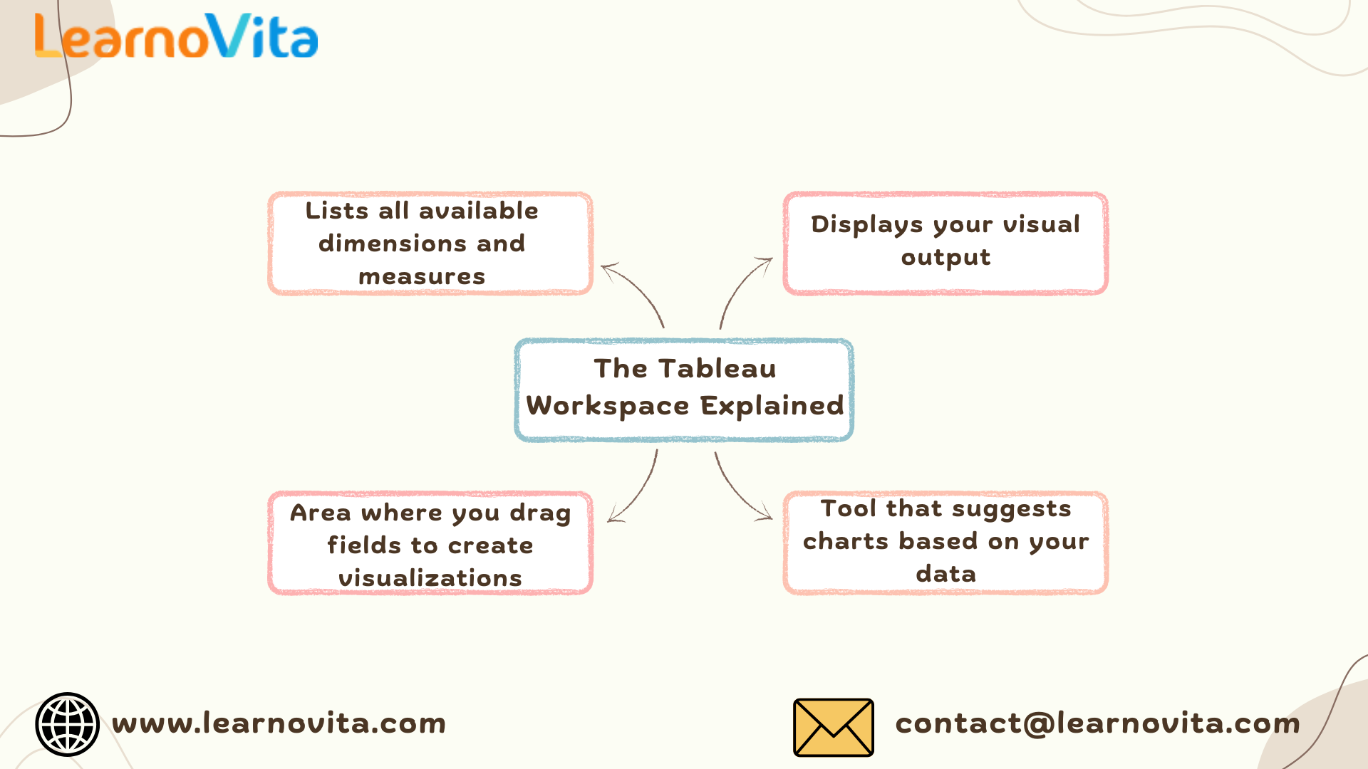
Understanding the Tableau Workspace
Tableau’s interface is clean and intuitive. On the left side, the Data pane shows all your fields, and the Rows and Columns shelves help you structure your visuals. The central canvas is where charts come to life, while the “Show Me” panel offers suggestions for chart types based on the selected data. Once you understand how these components work together, creating visuals becomes seamless and enjoyable.
Creating Your First Visualizations
With your data ready, simply drag and drop fields onto the canvas to create charts. For instance, placing “Category” on Columns and “Sales” on Rows instantly creates a bar chart. The “Show Me” panel suggests alternative visuals, such as line charts, pie charts, or maps. Tableau also offers ways to enhance visuals with filters, color gradients, tooltips, and dynamic labels, making data exploration more interactive.
Designing Dashboards and Data Stories
Dashboards combine multiple charts into a single, interactive view. You can add filters, controls, and actions to allow viewers to explore the data. Tableau’s Story feature enables users to create a guided walkthrough, connecting various visuals with narrative context. These tools are useful for building reports and presentations that communicate findings clearly and persuasively. Kickstart your career with the Best Training & Placement Program designed to equip you with in-demand skills and guaranteed job support.
Key Advantages of Using Tableau
Some of Tableau’s major benefits, especially for beginners, include:
-
No programming needed – Build visuals using a drag-and-drop interface.
-
Real-time data connections – Work with live data sources.
-
Flexible dashboard creation – Design custom layouts for desktop or mobile.
-
Strong learning community – Access tutorials, forums, and sample dashboards.
-
Multiple sharing options – Share via public links, secure servers, or embedded content.
These features make Tableau not only beginner-friendly but also scalable for professional use.
Sharing and Publishing Your Work
Once your dashboard is complete, Tableau makes it easy to share. With Tableau Public, you can publish your work online for others to view and interact with. In business settings, Tableau Online or Server lets you control access and collaborate securely. You can also export visuals as PDF, images, or embedded content for websites and presentations.
Helpful Tips for Beginners
Here are some practical suggestions to make your Tableau learning experience smoother:
-
Begin with small datasets to avoid complexity early on.
-
Stick to basic chart types like bar or line graphs.
-
Avoid overcrowding visuals; keep your message focused.
-
Use color and labels thoughtfully to highlight key insights.
-
Explore Tableau Public to learn from others’ dashboards.
With regular practice and experimentation, your skills will continue to grow.
Conclusion
Tableau is a reliable and user-friendly tool for anyone looking to understand and present data in a visual format. Its intuitive design, combined with powerful features, makes it an ideal choice for beginners and professionals alike. Whether you're exploring trends or building business dashboards, Tableau helps turn data into visual stories that are easy to understand and share. Start small, stay curious, and soon you'll be building visualizations that speak volumes.