Can Power BI Show Geographic Maps?
Introduction
Imagine opening a report and instantly seeing your sales, customer locations, or store performance not as rows in a spreadsheet but as points and shapes on a live, interactive map. Suddenly, trends become clear, sales hot spots jump out, regional performance becomes visible, and decision-making feels more natural. This is exactly what Power BI delivers with its powerful geographic mapping features.
Many people starting their journey through Power BI training and placement programs ask the same question: Can Power BI show geographic maps? The answer is a resounding yes. Not only can it show maps, but it also provides multiple mapping visuals that are highly interactive, customizable, and connected to real-time data sources. Whether you are using Power BI Desktop or working on cloud-based Power BI online training platforms, mapping visuals can take your reporting skills to the next level.
In this blog, we will explore everything you need to know about mapping in Power BI from the types of maps available and how they work, to real-world applications and step-by-step instructions for creating them. We’ll also highlight tips to make your maps accurate, engaging, and decision-ready.
Why Geographic Mapping in Power BI Matters
Geographic mapping is not just a nice visual addition, it is a strategic way to analyze data. In industries like retail, logistics, public health, finance, and education, location is often a critical variable. A table of sales by state might be informative, but a map showing sales distribution instantly makes the data more understandable.
In fact, studies show that humans process visual data up to 60,000 times faster than text. This is why professionals pursuing Microsoft BI developer certification are encouraged to master mapping features because decision-makers value insights they can grasp quickly.
Some of the benefits of mapping in Power BI include:
-
Visual Clarity: Easily identify high-performing regions and problem areas.
-
Interactive Exploration: Users can zoom, filter, and hover for detailed information.
-
Storytelling Power: Combine maps with other visuals to show relationships between location and performance metrics.
-
Real-Time Updates: Use live data to monitor trends as they happen.
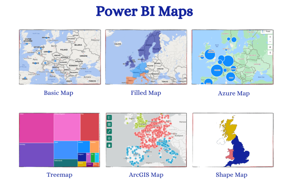
Mapping Options in Power BI
Power BI provides multiple mapping visuals, each with different strengths. Choosing the right one depends on your data and your goal.
1. Basic Map Visual
The basic Map visual plots data points based on latitude and longitude or geographic names (like city, state, or country). It’s great for showing location-specific metrics like sales per store or customer density.
Key Features:
-
Bubble sizes can represent a numeric value (e.g., sales volume).
-
Color intensity can indicate a category or performance level.
-
Works with Bing Maps to auto-detect locations.
2. Filled Map (Choropleth Map)
The Filled Map shades entire regions (states, countries, postal areas) based on a measure. This is useful for showing aggregated data like revenue by state or crime rates by district.
Key Features:
-
Uses geographic boundaries instead of points.
-
Great for comparing regional performance.
-
Highly visual for presentations.
3. Shape Map Visual
Shape Map allows you to display custom shapes and boundaries, which can be useful for non-standard geographic areas such as sales territories or school districts.
Key Features:
-
Supports custom TopoJSON files.
-
Allows non-geographic mapping (like floor plans).
-
Ideal for specialized industries.
4. ArcGIS Maps for Power BI
This premium mapping option is powered by Esri’s ArcGIS technology and offers advanced geographic analytics.
Key Features:
-
Rich base maps, heat maps, and clustering.
-
Demographic data overlays.
-
Enhanced customization options.
How Power BI Recognizes Location Data
One of the powerful aspects of Power BI is its ability to interpret geographic data automatically. When you load a dataset, you can set the Data Category for fields like City, Country, State, or Postal Code. Power BI then uses Bing Maps to match these locations and plot them correctly.
Pro Tip: For accuracy, always provide the highest level of location detail possible preferably with latitude and longitude. This avoids confusion between cities with the same name (e.g., Springfield in different states).
Step-by-Step Guide: Creating a Map in Power BI
Let’s go through a practical example of creating a basic geographic map in Power BI.
Scenario: You want to show sales performance by city for a retail chain.
Step 1: Prepare Your Data
Make sure your dataset includes:
-
City Name (or other geographic field)
-
Sales Amount
-
Optional: Latitude and Longitude for precise plotting.
If you are following along in a Powerbi online training course, you might be given sample data files to practice with.
Step 2: Load Data into Power BI
-
Open Power BI Desktop.
-
Click Home → Get Data → Excel (or another source).
-
Load your dataset into the report.
Step 3: Set Data Categories
-
Select the City column.
-
Go to Column Tools → Data Category and choose City.
-
This tells Power BI how to interpret the data for mapping.
Step 4: Add a Map Visual
-
From the Visualizations pane, select the Map icon.
-
Drag City to the Location field well.
-
Drag Sales Amount to the Size field well.
-
You should now see bubbles on the map, sized according to sales.
Step 5: Customize the Map
-
Adjust zoom level for better visibility.
-
Change bubble colors based on performance categories.
-
Add filters or slicers to make the map interactive.
Real-World Use Cases for Power BI Maps
1. Retail Store Performance
A retail company can use Filled Maps to compare store sales by region. This helps identify which areas are outperforming and which need improvement.
2. Logistics and Delivery
A logistics firm can track delivery routes and times using Map visuals, optimizing routes based on geographic insights.
3. Public Health Tracking
Health organizations can use maps to visualize disease outbreaks, vaccination coverage, or hospital capacity by area.
4. Sales Territory Management
Sales teams can overlay their territories on a Shape Map to ensure equitable distribution and performance monitoring.
5. Marketing Campaign Impact
Marketers can analyze how different geographic areas respond to campaigns by mapping customer engagement data.
Tips for Creating Accurate and Effective Maps
-
Use Latitude and Longitude When Possible – This removes ambiguity.
-
Avoid Overcrowding – Too many data points can clutter the map. Use aggregation or clustering.
-
Choose the Right Map Type – Points for specific locations, filled for regions.
-
Optimize Performance – Large datasets can slow maps; consider filtering or aggregating.
-
Test with Different Zoom Levels – Make sure the map is readable both close-up and zoomed out.
Common Mistakes to Avoid
-
Incorrect Data Categories: Forgetting to set the correct data category leads to misplotted points.
-
Over-Reliance on Auto-Mapping: Always verify Bing Maps’ interpretation.
-
Ignoring User Interaction: A static map is less engaging add slicers and filters.
-
Using Only Default Colors: Custom color schemes can make maps more readable and on-brand.
Advanced Mapping Features for Professionals
If you are working toward a Microsoft BI developer certification, mastering advanced map features can set you apart.
-
Heat Maps: Highlight intensity of data with color gradients.
-
Clustering: Group nearby data points for better readability.
-
Demographic Overlays: Add population, income, or age data for deeper analysis.
-
Custom Boundaries: Use Shape Maps for non-standard regions.
The Role of Maps in BI Career Development
Professionals who master mapping in Power BI often find it easier to explain data insights to non-technical stakeholders. In Power BI online classes, instructors emphasize this skill because visual storytelling is increasingly valued in business environments.
Employers also recognize mapping expertise when hiring for data analyst and BI developer roles. Candidates who can combine technical skills with visualization talent are often better positioned for high-demand jobs, especially when supported by certifications and real-world project experience.
Learning Mapping in Power BI – The Training Path
If you are serious about mastering maps in Power BI, follow this structured approach:
-
Foundational Learning: Enroll in beginner-friendly Power BI online courses that cover data importing, cleaning, and basic visuals.
-
Intermediate Skills: Practice with map visuals, filled maps, and shape maps using sample datasets.
-
Advanced Features: Learn ArcGIS integration, custom TopoJSON shapes, and dynamic filtering.
-
Project Work: Build real-world mapping dashboards to showcase in your portfolio.
-
Certification Prep: Complete a Microsoft BI developer certification course to validate your skills.
Future of Mapping in Power BI
With Microsoft continually improving Power BI, geographic mapping features are becoming more powerful. We can expect:
-
Better AI-based Location Recognition to reduce mapping errors.
-
Integration with IoT Devices for live geographic tracking.
-
3D Mapping Capabilities for industries like real estate and urban planning.
Professionals who invest in learning these skills now will stay ahead as these features roll out.
Conclusion
Power BI’s ability to show geographic maps is not just a simple feature it’s a game-changer for professionals who need to present location-based insights. Whether you’re analyzing sales, tracking deliveries, or planning public services, maps transform raw data into actionable visual stories.
With the right training, such as Power bi online courses and placement programs or Power BI online classes, you can master mapping visuals and make your reports both informative and visually engaging.
Start exploring mapping in Power BI today and turn your location data into insights that drive results. Your next breakthrough decision could be one map away.