Enhancing Your Brand with Custom Typography: A Practical Playbook
Introduction
If your logo is your handshake, your typography is the conversation that follows. Most brands default to whatever the design tool suggests, then wonder why everything feels generic. This guide shows you how enhancing your brand with custom typography can create instant recognition, smoother reading, and a more confident voice—without bloat or fuss.
We’ll cover practical steps: choosing and pairing typefaces, building a system, keeping pages fast, and making sure the text your customers see daily actually helps them. Whether you’re a startup founder, a marketer, or the team’s unofficial “design person,” you’ll leave with a playbook you can implement this week.
Key Takeaways (TL;DR)
-
Treat type as a system: one headline face, one text face, clear roles, and a small scale.
-
Prioritize legibility and performance before ornament; brand voice comes from consistent execution.
-
Variable fonts and proper loading strategies keep pages fast and flexible.
-
Document capitalization, spacing, and fallback stacks to avoid drift.
-
Test on real screens; measure clarity, consistency, and speed—not vibes alone.
Why Custom Typography Matters
Core Concepts and Definitions
A typeface is the design (e.g., Inter); a font is a file of that design (e.g., Inter Regular). Display faces are for big statements; text faces are tuned for paragraphs. Important features to understand: x-height (affects readability), contrast (thick/thin stroke difference), spacing (letter- and word-spacing), and optical sizing (how a face behaves at different sizes).
A type system assigns roles—H1/H2/H3, body, caption, buttons—and rules like sizes, line lengths, and spacing. “Custom” doesn’t always mean you drew a typeface from scratch. It can mean a carefully curated pairing, a licensed family with brand-specific settings, or a light modification of a retail face.
Benefits, Risks, and the Business Case
Benefits: distinctiveness in crowded feeds, smoother scanning, and more coherent interfaces. Good typography reduces cognitive load; users find what they need faster.
Risks: illegible display fonts, bloated files, licensing gaps, or poor language support. These are avoidable with a clear process: test early, choose broadly supported families, and document decisions.
The Framework: From Mood to System
Step 1: Clarify Brand Voice and Use Cases
List three adjectives for your brand voice (e.g., warm, modern, precise). Map your top text surfaces: homepage hero, product UI, emails, slide decks. Knowing where type will live keeps choices honest. A product dashboard needs a sturdy, screen-friendly text face; a campaign hero can be expressive.
Step 2: Explore Letterforms and Visual Direction
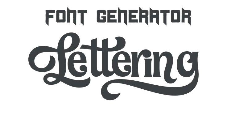
Create a quick mood board: humanist vs. geometric sans, transitional vs. modern serif, playful vs. utilitarian. For headlines, you can audition expressive letterforms with an online fancy font generator to spark ideas—useful for exploring vibe before you commit to licensing or design work. Try it here: experiment with stylized letterforms. Then sanity-check on mobile for readability.
Step 3: Choose a Pairing (or One Variable Family)
Pick one display (for big moments) and one text face (for everything else). Or choose a single variable font that covers weights/widths to reduce files and maintain coherence. Look for:
-
Multiple weights (at least Regular, Medium, Bold) and true italics.
-
Clear numerals (tabular for UI), punctuation, and currency symbols.
-
Strong legibility at 14–16 px for body copy and in dense UI.
Step 4: Build the Type Scale and Roles
Start small. A classic scale might be: 12 (caption), 14–16 (body), 20 (H3), 24 (H2), 32–40 (H1). Set line length to ~45–75 characters for reading comfort and bump line-height for paragraphs. Assign roles in a table (H1/H2/H3, body, small, button) with size, weight, and spacing. Decide when to use sentence case vs. Title Case and write it down.
Step 5: Performance and Implementation
Use modern formats and a smart loading strategy:
-
Preload your primary font files.
-
Use
font-display: swap(or optional fallback behavior that suits your brand). -
Subset if you truly need to, but keep language coverage in mind.
-
Build a robust fallback stack (e.g.,
ui-sans-serif, system-ui, -apple-system, Segoe UI, Roboto, ...).
Variable fonts often replace several static files with one—tidier and sometimes faster. Test on real devices, not just your design canvas.
Step 6: Accessibility and Internationalization
Aim for comfortable body sizes, generous contrast, and legible weights. Ensure the family supports necessary languages and diacritics. For data-heavy UI, prefer tabular numerals for alignment. Avoid ultra-light weights on low-contrast backgrounds. If text overlays images, add a subtle gradient or color block for clarity.
Tips for Implementation
-
Create tokens:
--font-body,--font-heading,--size-body, etc. Tokens make consistency easy across web, app, and slides. -
Document capitalization choices. Need to enforce Title Case? Run headlines through a quick text case converter during reviews so styles stay consistent.
-
Set editorial guardrails: max headline lines, when to break, where to use italics vs. bold.
-
Keep a “bad examples” section in your brand doc—quicker to teach what not to do.
Examples and Scenarios
Example 1: DTC Skincare Launch → Recognizable, Soft Authority
Context: A new DTC skincare brand felt sterile using a common geometric sans everywhere.
Action: Introduced a high-contrast serif for headlines, retained a humanist sans for body/UI, and standardized a gentle scale (16/24 body, 32 H2, 40 H1).
Result: Packaging and social felt instantly recognizable. Copy read warmer without sacrificing clarity in product pages and checkout.
Example 2: SaaS Analytics Redesign → Faster UI, Clearer Data
Context: Dashboard felt noisy; multiple fonts, inconsistent sizes.
Action: Moved to a single variable sans with tabular numerals and defined tokens for headers, tables, and code. Consolidated from six sizes to four.
Result: Cleaner visual rhythm and fewer font files. Team shipped features faster because typography decisions were pre-made.
Pitfalls & Fixes
-
Illegible display on mobile: Use display fonts only above a minimum size; provide a safe fallback style.
-
Too many weights: Limit to 2–3 for body and key headings; bring in one accent weight sparingly.
-
Missing italics: If you need emphasis in long-form content, true italics are non-negotiable.
-
Poor fallback stacks: Test with fonts blocked; if the layout collapses, adjust metrics or stacks.
-
License blind spots: Confirm commercial use, app embedding, and ebook rights before launch.
Comparisons / Decision Guide
-
Fully Custom Typeface
Pros: Max distinctiveness, perfect brand fit.
Cons: Costly, longer timeline, requires expert maintenance.
Choose if: You’re rebranding at scale and can support ongoing updates. -
Modified Retail (Customization Layer)
Pros: Faster, cheaper, still unique (custom alternates, ligatures, spacing).
Cons: Requires foundry approval and skilled execution.
Choose if: You want signature details without starting from zero. -
Curated Pairing (Off-the-Shelf)
Pros: Fast, economical, easier to implement.
Cons: Less unique; needs disciplined documentation to feel bespoke.
Choose if: You need impact in weeks, not months.
Tools & Resources
Top Picks (Why/When to Use)
-
Figma/Sketch: Rapid prototyping and tokenizing your scale.
-
Type Foundries & Libraries: Explore broad language support and licensing options.
-
Variable Font Testers: Check weight/width axes in context.
-
Contrast Checkers: Validate accessibility with real colors.
-
Proofing Sheets: Print and screen tests at multiple sizes.
Free vs. Paid Options
Free libraries are excellent for MVPs and internal tools. Paid families typically offer more styles, better hinting, broader language support, and clearer licensing. If your product is customer-facing and high-traffic, paid options (or modified retail) are often worth the stability and distinctiveness.
Metrics & Measurement
Measure what typography should influence—clarity, consistency, and speed:
-
Clarity: Reduce wall-of-text by capping headline length and maintaining readable line lengths. Need to check character counts quickly? A simple character counter keeps headlines on-brief and within layout constraints.
-
Consistency: Audit components for token usage; track “off-scale” sizes and rogue fonts in PRs or design QA.
-
Speed: Monitor font file weight, number of requests, and render behavior (flash of invisible/unstyled text). Tie changes to page-level metrics like LCP.
-
Qualitative: Run quick user reads—can people scan headlines and numbers at arm’s length on a phone? If not, adjust size/contrast.
FAQ
Do I need a fully custom typeface to look unique?
Not always. A well-chosen pairing with a few tailored adjustments (spacing, alternates, figure style) and consistent rules can feel bespoke. Go fully custom when the brand demands signature forms or heavy multilingual coverage with exacting needs.
How many fonts should a brand use?
Two is a solid default: one for display/headlines, one for body/UI. Add a third only if it solves a clear problem—like mono for code or a condensed style for dense tables. Fewer fonts mean faster decisions and cleaner pages.
Will custom typography slow down my site?
It doesn’t have to. Use modern formats, preload critical files, consider variable fonts to reduce requests, and set font-display carefully. Test on slow networks and keep an eye on your Core Web Vitals.
Conclusion
Final Thoughts
Enhancing your brand with custom typography isn’t about chasing trendy letterforms. It’s about creating a dependable system that makes every headline confident, every paragraph clear, and every interface easier to use.
Next Steps (Clear CTA)
Define your voice, pick a text-first workhorse, and add one expressive display style. Build a tiny scale, document capitalization rules, and ship a pilot page. Review, refine, and roll the system across your top three touchpoints.
 Romaian
 English
 Arabic
 French
 Spanish
 Portuguese
 Deutsch
 Turkish
 Dutch
Dutch
 Italiano
 Russian
 Portuguese (Brazil)
 Greek
Greek